Overview
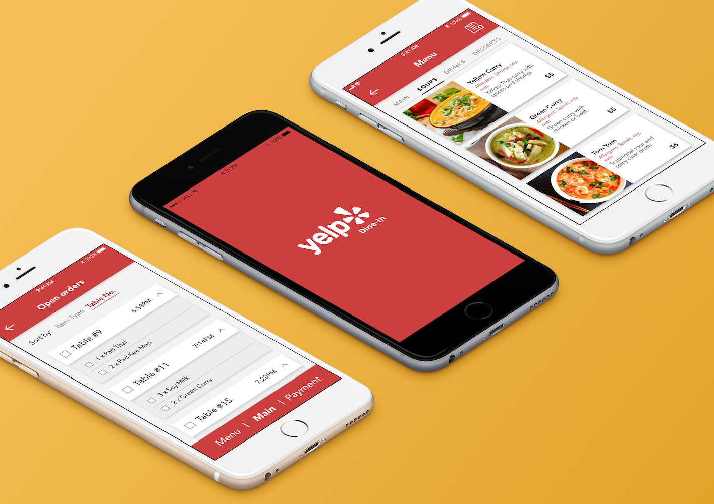
For UC Berkeley’s Product Management class, our cross-functional team of five were guided by industry mentors to identify a market need, conduct competitive and user research, and practise rapid prototyping using agile and scrum methodologies.
Our Hypothesis
Inspired by grab-&-go food apps like Snackpass and Good Life, our team formed around the idea of streamlining the customer experience at dine-in restaurants. We believed that integrating mobile technology into the dining experience could cut down wait times, simplify ordering and payment processes, and deliver significant cost savings to restaurant owners.
Understanding the Customer
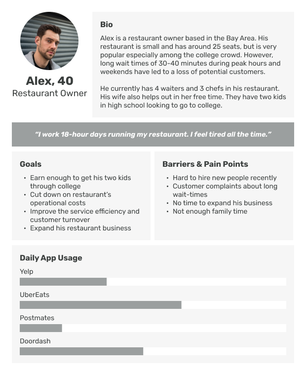
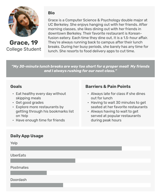
Our team conducted interviews with several restaurant owners and college students in Berkeley. As the team’s primary UX Designer, I came up with the following user personas to summarise our findings:
The Value Proposition
Once we understood our customers better, we were able to fine-tune our solution to suit their needs and thus tap on latent demand: an extension to the popular review app Yelp that would integrate queuing, ordering and payment in a single place.
Restaurant owners and diners had three major pain points about the dining process:
- It takes too long. On average, diners spend 1.5 hours at a restaurant, with 45 minutes spent on queuing, ordering, waiting and paying.
- Labour is expensive. The average American household spends $420 a month tipping at restaurants. Labour costs account for 30-40% of restaurants’ total expenses.
- It's not personalised. Diners often face the paradox of choice and would prefer to have recommendations tailored to their taste.
Yelp Dine-In would allow diners to save 15-30 minutes on their dining time, as well as do away with the 15% markup in tips. For restaurant owners, we could cut 20% in operating costs by hiring fewer workers, increase diner turnover and gather more feedback about the food from diners.
Scoping the MVP
We decided to scope out particular groups of users to target with our first release. For restaurants, we targeted low- to mid-range restaurants in the Bay Area for whom the savings in labour costs would be extremely significant. As for the diners, we targeted college students who are both tech-savvy and price-conscious.
To measure the adoption rate of our solution, we came up with two key metrics: the number of restaurants registering for, and the number of diner transactions through Yelp Dine-In.
We crafted the user stories that we wanted our MVP to address:
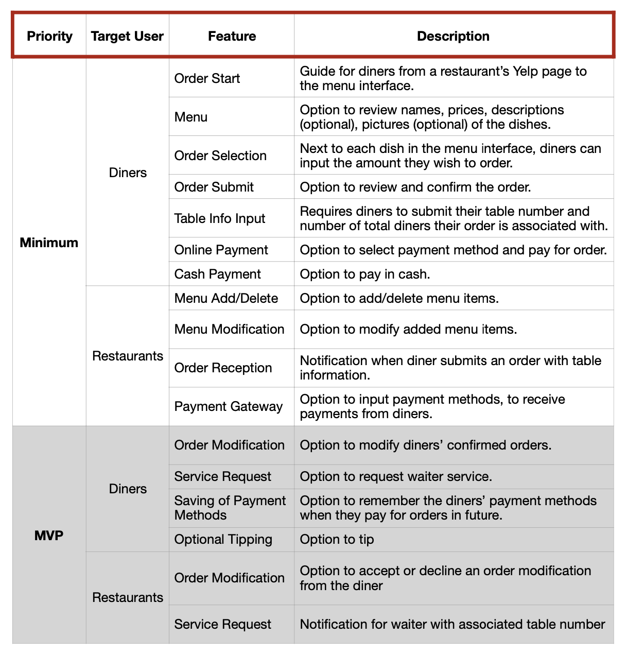
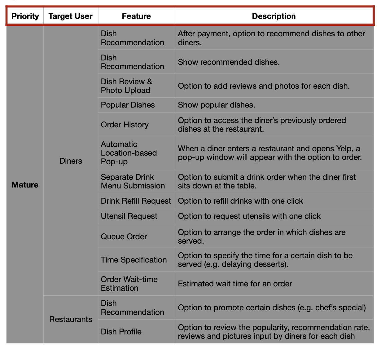
Based on the stories, we came up with a list of features our solution should have - and categorised them into minimum, MVP, and mature.
Prototyping
As the lead designer, I came up with several rounds of prototypes - from lo-fi sketches to a clickable prototype. At each stage, I validated my work with the rest of the team to make sure that the design was in line with our objective of streamlining the dine-in experience, and that my designs were not adding unnecessary bulk to the user flows.
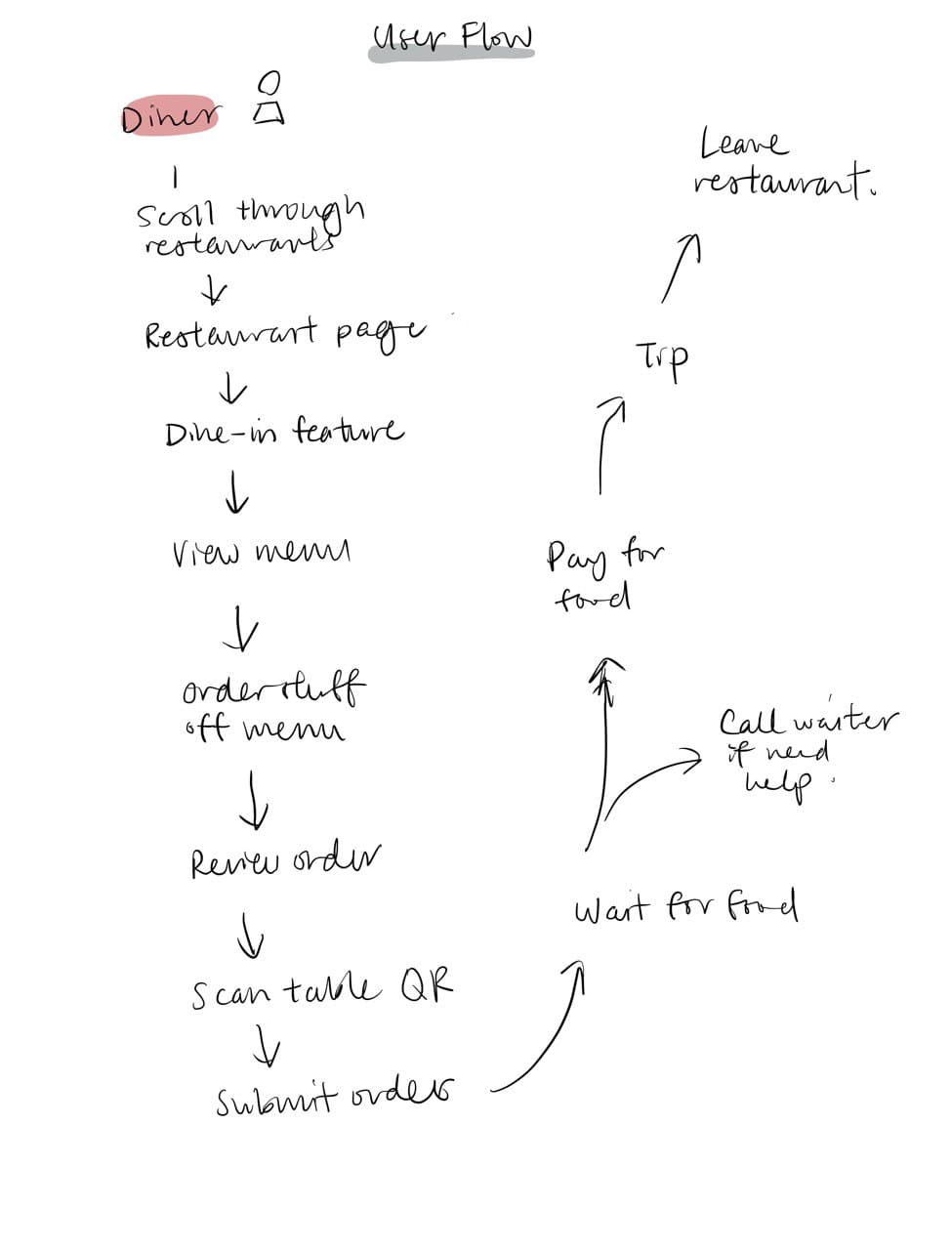
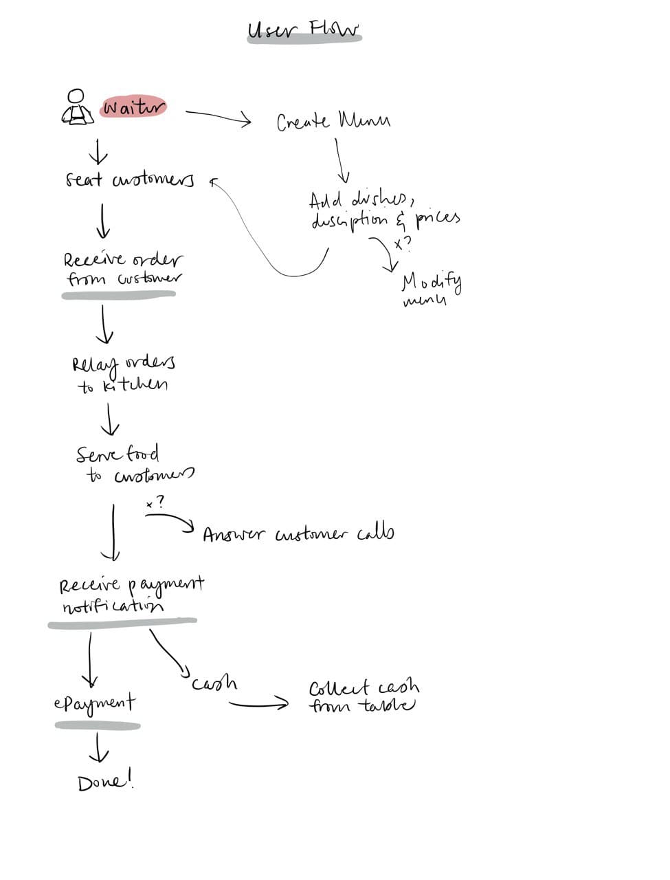
First was coming up with the overall user flows.
Next, some quick sketches of what the screens would look like.


The sketches were then translated into clickable mockups using Adobe XD. Two app mockups were created, a diner app and a restaurant app.
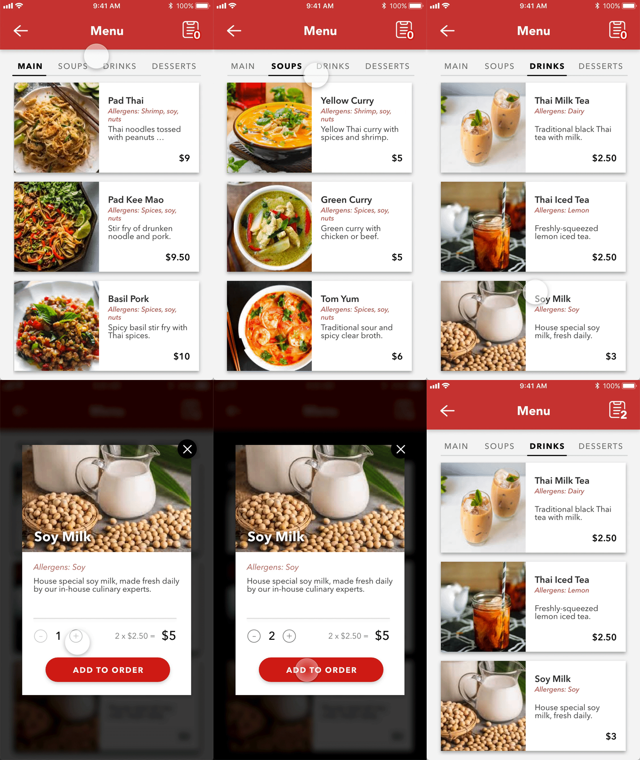
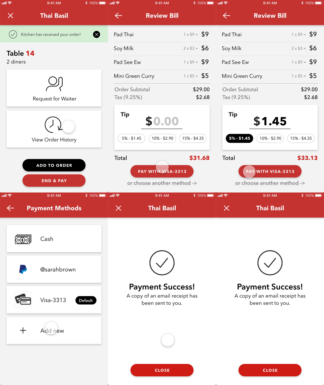
You may view the full clickable prototype here.
User Interviews & Testing
Our team conducted user interviews with restaurant owners in Berkeley to gather their thoughts on our proposed solution. We also conducted user testing by letting them test-drive our app prototypes at various stages of the design process.
The diners surveyed responded favourably to the app prototype and suggested features like food customisation requests and bill splitting. The restaurant owners appreciated the increased turnover that our solution promised. However, they had security concerns over service staff using the app on their personal devices.
Overall, we found the interview findings promising. We added the food customisation feature for diners, and a user management system for restaurant staff, to our prototype based on the user feedback.
Final Presentation & Reflections
After two months of working on the project, we presented our pitch and prototype to a panel of judges, most of whom were working as Product Managers in tech companies.
Reflecting on the experience, these are my main takeaways from the class:
- Choose your team wisely. Much of the project’s success could be attributed to the good mix of specialisations we had within our team. Between the five of us, we had strengths in marketing, business strategy, design and engineering. This allowed us to delegate our tasks efficiently and learn from one another’s expertise.
- Limit the scope of the MVP. It was easy to get carried away when we were coming up with potential features for our solution. However, not all features contributed meaningfully to our value proposition, yet added additional development time. Thus, it was important to be clear-headed and decisive about which features to include in our first launch.
- Get the users involved at regular checkpoints. Just like any other part of the agile process, user testing activities should be lean, iterative and frequent. Testing on small groups of diners and restaurant owners frequently allowed us to address their feedback immediately.

