Overview
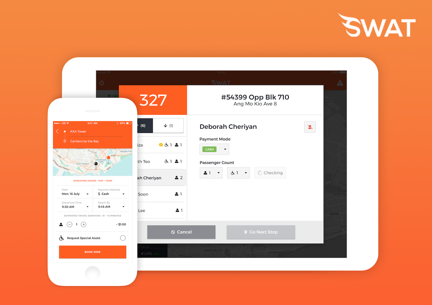
SWAT is a mobility company offering on-demand bus services in Singapore, Australia, London and other countries in South-East Asia. Working in a small startup team, I wore multiple hats: Product Manager, UX Designer and Graphic Designer. I worked closely with the business operations team and developer team to design features for SWAT’s mobile, tablet and web-based apps.
Design Process
At SWAT, new features typically go through the following process:

During my internship, I worked primarily on two particular features: wheelchair accessibility and bus interchange navigation, involving myself mostly in the requirements gathering, prototyping and user testing stages.
I was also the Product Owner (PO) of the bus interchange navigation feature, the point person who oversaw the end-to-end process from requirements gathering to production.
Requirements Gathering
During this stage, I created user journey maps that consolidated our user research to identify the user’s pain points and design opportunities at each stage. I then broke the feature down into a list of functional and non-functional requirements, as well as sizable user stories to guide the prototyping stage. All these were documented in a Product Requirement Document (PRD), which served as a guide among the team to align business, design and technical requirements.
Prototyping
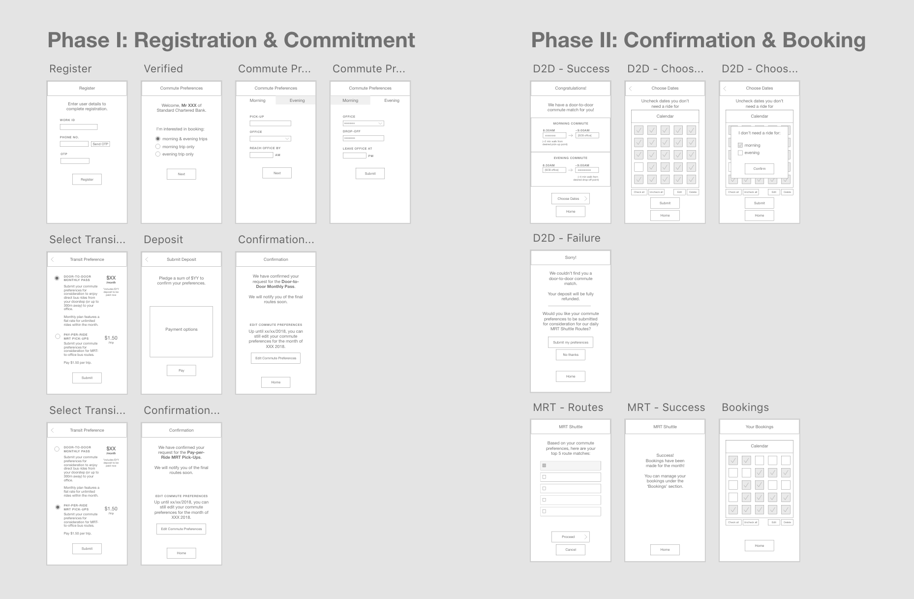
I then translated the user stories from the PRD into a series of wireframes. These served as a lo-fi prototype that was used to gather quick feedback.
I worked on the wireframes for a particular B2B feature: corporate season passes. This feature was designed for a business client who wanted to employ regular shuttle bus services for their staff.
For this feature, an initial set of wireframes was shown to both the client and our internal team, who then raised the following concerns:
- Customising specific dates. They wanted their staff to be able to select particular dates to opt out of the bus service, so that the bus does not need to make unnecessary stops.
- Preventing no-shows. The monthly shuttle service should algorithmically generate a route based on the pick-up points of the staff members who had indicated their interest. Staff members who pull out after the cutoff date will then affect the eventual shuttle bus route. How can we prevent this from happening?

To address the issues raised, I incorporated the following into my wireframes (as seen above):
- Multi-selection of bookings. Staff members are able to opt out of specific dates through a calendar view, which provides an easily understandable representation of their ride bookings for the month.
- Deposit. Staff members who wish to sign up for the monthly shuttle service must pay a deposit to submit their preferences. The deposit will be forfeited should they withdraw their interest after the cutoff date.

Once all stakeholders were satisfied with the wireframes, I created a hi-fi clickable prototype in Sketch. The hi-fi prototype was edited for visual consistency tweaks before being handed off to the development team for implementation. Having a hi-fi prototype ensures that design elements are properly standardised across the app.
User Testing
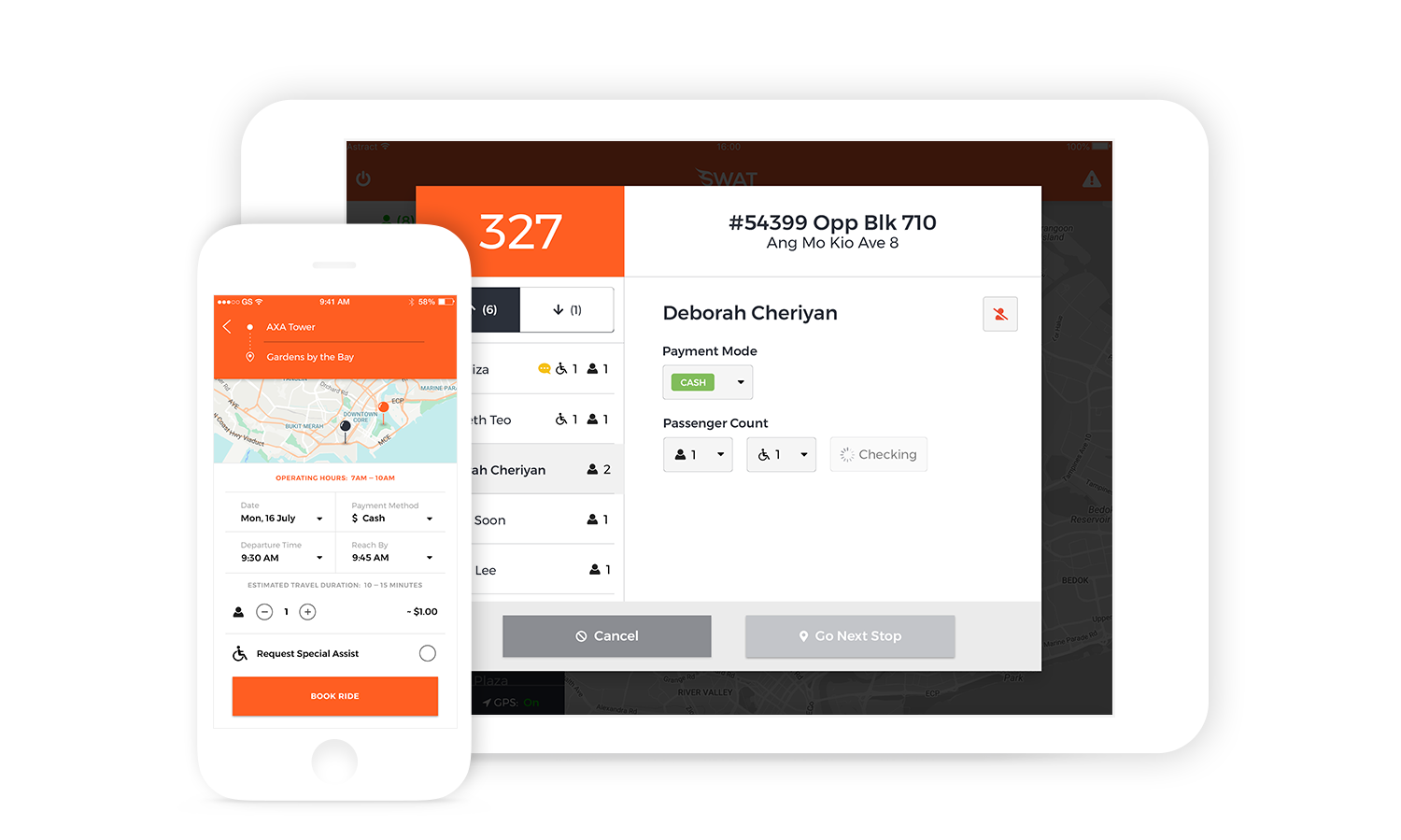
Once the initial development of the feature is done, user testing with our customers was conducted to ensure that the feature meets their needs. This stage is also a good opportunity for us to identify and smooth out UI discrepancies. For example, seeing how bus drivers interacted with our app while they were driving made us realise the difficulties of using the app with divided attention. We thus redesigned the driver app to minimise mental load such that actions could be completed while driving. We colour-coded UI elements such that they were easily recognisable even when in peripheral vision, and simplified the screens to only show information that was immediately pertinent to the driver.
Graphic Design
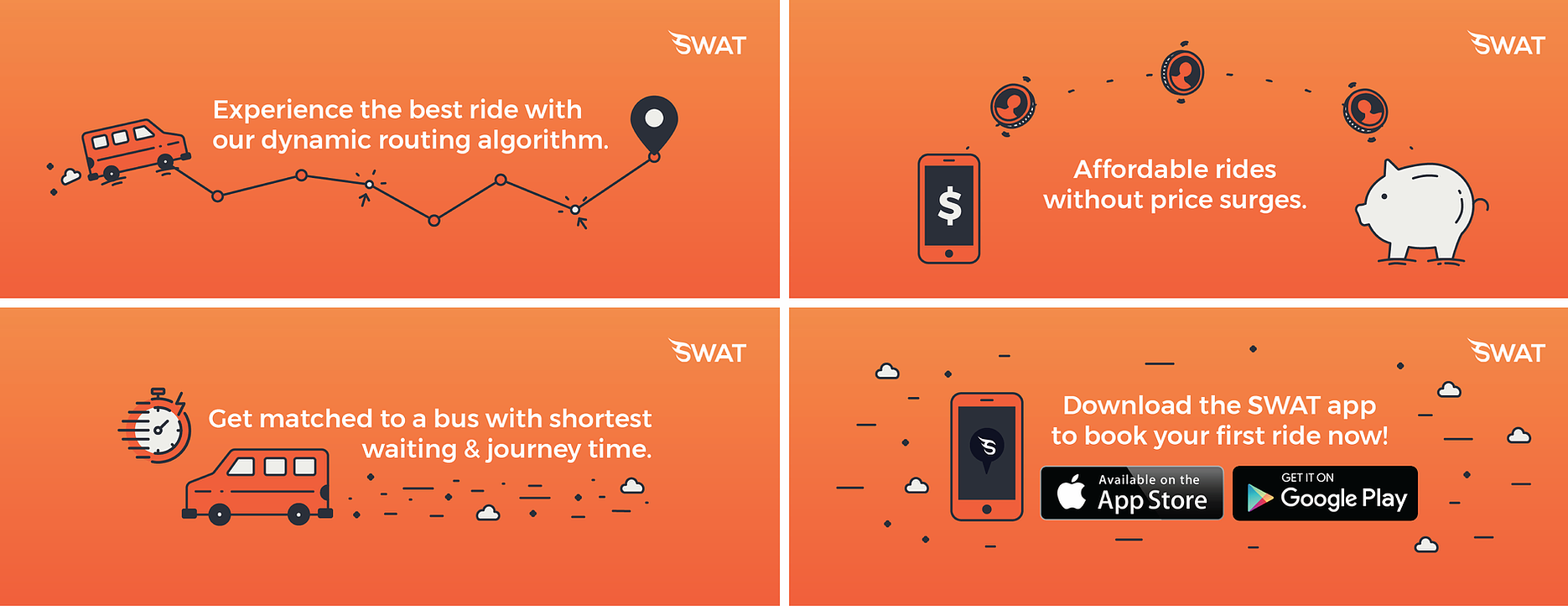
Besides working on SWAT’s main products, I also worked on graphic design for the company. This includes some promotional banners for their social media platforms.


